The Canyon Salon ReBrand
When The Canyon Salon in Thousand Oaks set out to elevate its digital presence, they turned to Red Ink Brand to create a look and feel that matched the salon’s reputation for style, sophistication, and community.
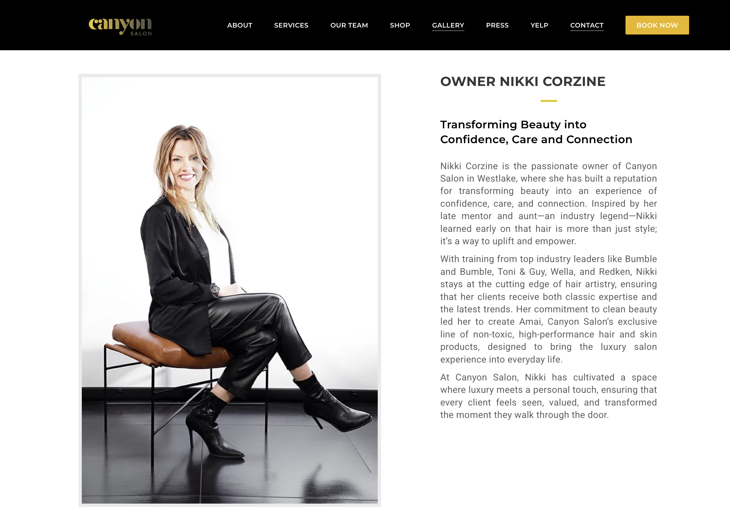
Branding & Logo Design
We crafted a clean, modern logo that reflects The Canyon Salon’s identity as both a neighborhood gathering place and a luxury destination. The design balances elegance with approachability—instantly recognizable, versatile across digital and print, and perfectly aligned with the salon’s vision of effortless beauty.
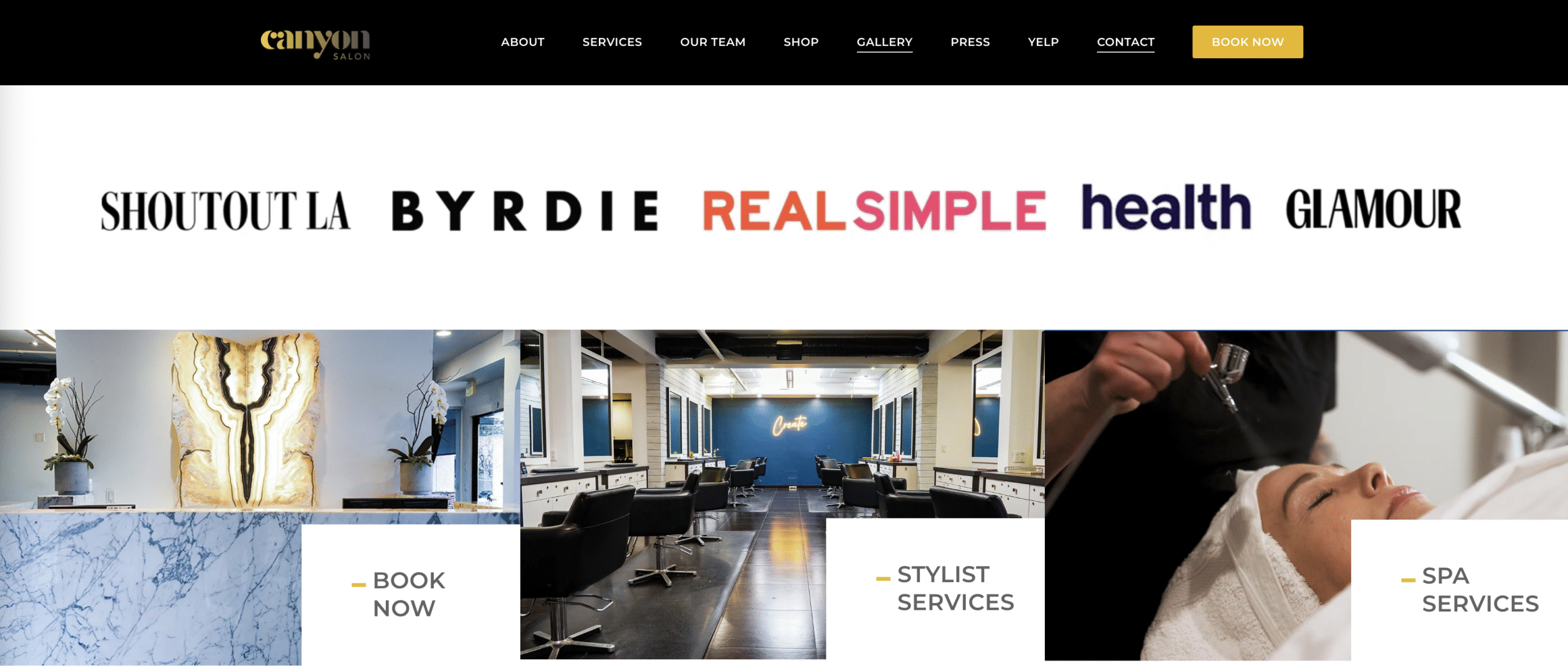
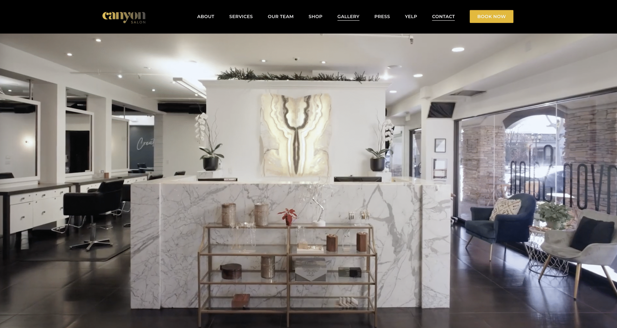
Website Design and Concept
The Canyon Salon’s new website was built to be as polished and user-friendly as the experience clients receive in the chair. We focused on:
- Aesthetic: A minimal, editorial-inspired layout with strong typography and curated imagery.
- Functionality: Mobile-first design, seamless booking integration, and intuitive navigation to make appointments easy.
- Performance: Fast load times, SEO-friendly structure, and optimized visuals to highlight services, stylists, and location.


The Red Ink Brand Impact
The redesigned brand identity and website positioned The Canyon Salon as more than a local service, it became a Southern California lifestyle statement. The result is a cohesive digital footprint that attracts new clients, reinforces loyalty, and showcases the salon’s artistry at first glance.